About
the project

Logo for Spoko Bridge
Timeline 3 days
Client Fundacja Floating EKA
Year 2026
Spoko Bridge — is an international pilot project testing the model of Giving Circles (giving circles) in Eastern Europe and Central Asia (specifically, in Poland and Kazakhstan). The initiative supports social and community projects created and led by women (women-led initiatives).
Unlike traditional crowdfunding, where each donor acts independently, Giving Circle builds a community: people contribute to a shared fund and jointly decide who will receive funding.
The Task and Challenges
The main objective of the design was to convey the initiative's core philosophy:
- Community and equality: Bringing people together around a shared goal.
- A bridge between regions: A connection between Poland and Kazakhstan, fostering international integration.
- Transparency and sustainability: A reliable platform for collaborative decision-making and the development of women leaders.
Starting Point: Working with an AI-Generated Concept
The client already had an initial logo draft that she had generated with artificial intelligence based on her prompts. The AI-proposed logo featured a standalone circle made up of multicolored elements and a separate wordmark.
The AI produced a basic concept, but the result felt disjointed: the circle stood on its own, disconnected from the name, while the graphic required professional refinement, precision, and visual cohesion. My task was to take this initial concept, extract as much meaning from it as possible, and transform the draft into a complete, thoughtfully designed vector mark.
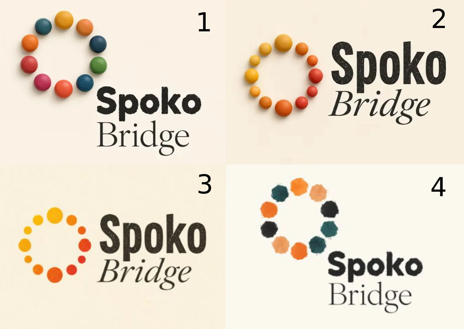
The client generated these logos for the project using artificial intelligence
Logo concept and metaphor
In the original AI-generated version, the circle was completely closed. I decided to break open this closed shape, freeing the mark from its sense of isolation. A closed circle symbolizes turning inward, whereas the project's initiative is about growth, reaching outward, scaling, and dialogue.
Instead of keeping the mark separate from the text, I integrated the updated dotted arc directly into the composition of the name—around the first letter “S”. Now the circle no longer simply floats alongside the name, but organically rises and “embraces” it, becoming an integral part of the project name and creating the image of a bridge.

The logo is built on the synergy between the wordmark and a graphic element that forms a semicircle/arc around the first letter “S”.
- Giving Circle: Dots in different colors and shades symbolize the members of the circle. Each dot represents an individual or organization with a unique contribution, focus, and expertise. Together, they form a unified, open ring that illustrates the principles of shared ownership and collective choice.
- Bridge and dynamics: The arc of dots visually resembles the span of a bridge connecting countries, ideas, and people. The varying sizes and colors of the dots emphasize the initiative's inclusivity, flexibility, and continuous development.
- Typography: The main word “Spoko” is set in a bold, solid, and friendly sans-serif typeface that conveys confidence and reliability. The word “Bridge” is set in a clean, light typeface that balances the composition and gives it an airy feel.
Color palette and adaptability
The palette reflects the project's diversity and vibrant character:
- Warm terracotta and orange tones: Symbolize energy, mutual support, human warmth, and creativity.
- Deep turquoise-emerald hue: Adds balance and evokes stability, trust, and harmony.
- Dark gray / contrasting light tones: Ensure excellent readability and a strong, confident structure.
The logo is designed to look equally effective on both light and dark backgrounds, adapting easily to social media, web platforms, presentations, and print materials.
Results
I was able to transform a raw AI sketch into a thoughtful, cohesive visual identity. The logo Spoko Bridge does more than simply represent the project—it tells its story: breaking down barriers, bringing people together in an open circle, and building bridges between communities.
The visual identity Spoko Bridge is flexible, thoughtful, and aesthetically appealing. It is uncluttered, easy to understand, and clearly conveys the values of modern collective fundraising and women's leadership.